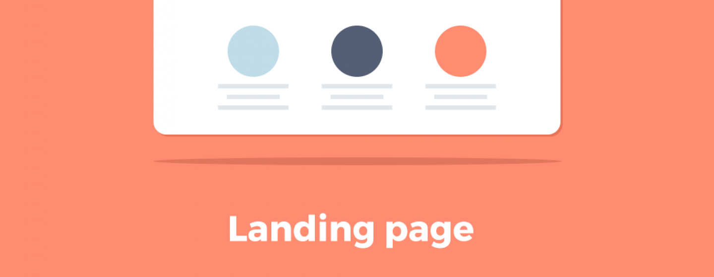
Tips for creating a triggering landing page
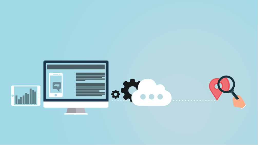
How to boost your newsletters subscription ratio?
Numerous landing page best practices, tips and tricks could probably make a difference. But we will explain what has a direct impact on your conversion rate!
“TRIGGER”
Imagine you landed on an island way far from civilization. Your Neo Robinson Crusoe journey begins. After having made first steps you stumbled upon a hut-like construction slightly resembling a house.
Genuine curiosity overpowers hesitations and you head inside. First object you find is something similar to a comb. No clue what is it, but shapes and components are somehow giving hints about its main purpose. Handle should perfectly fit a hand, while teeth are probably purposed for brushing.
Most of the surrounding objects have embedded hints, we call them triggers.
They give us subconscious signals. Even your door handle “welcomes” to press on it and enter.
Same rule applies to digital field. Having landed on your page for the first time, visitors are digital Crusoes. You are obliged to guide them through the website. And let visitors know what you are expecting them to do. Turn on your triggers!
If there is no trigger, visitor gets lost by wondering in the corners of your page until they get bored.
A call to action will tell visitors to take the comb and brush whatever you ask them!
“Start your free trial of our CRM software!” is an example of a concise CTA. Visitors clearly know what they will get by filling in your landing page.
MAKE YOUR CTA SCREAM
Two main landing page attributes guide visitors with no verbal explanations:
- Blank field tells visitors to fill it;
- Button persuades them to press on it.
The button should be eye-catching and evoke tactile sensations. It is not a button if it’s not seducing to press on it.
Make your CTA intuitive and attention drawing. By fulfilling these conditions, you are not pressured to introduce supplementary explanations.
AVOID CALL-TO-INACTION!
Some attributes are calling-to-action, meanwhile other elements are literally begging to do nothing.
As an example a grayscale “Save” button perfectly fulfills its functions on your desktop, we believe. However, it’s a last choice for your landing page, only if you want to keep your conversion rates quite near zero. Ghost-buttons are likely to be ignored, or even get unnoticed, as users mastered to filter out dim tones.
Show the whole picture
“Next” button gives only superficial feeling of clear CTA. Visitors have no clear idea where exactly they are heading to. A tiny puzzle-piece won’t tell them as much as they are expecting to hear. Make clear statements of what you want and how they will be rewarded for efforts.
None of us wants to be fooled!
If visitors are slightly confused, the first problem-solving instinct will tell them to close your landing page window. Consequently, you lost your potential lead. For those who want to dig deeper into landing page strategies, go see the Udemy Landing page building course, including buyer psychology factors.